Layout Idea: Monthly & Daily
/Hello there,
Now that you’ve gotten a journal, app, binder, etc. and a pen, pencil or stylus you have probably gotten started. You probably started with the original system, i.e. use a monthly spread along with daily pages/sections. For many, this works well. Others find that they require a more eagle-eyed approach on a week to week basis. They’ve either incorporated weekly pages into the mix, added in trackers of some kind or another or some other tweak. Over the next few posts we’ll be discussing the merits of each approach in order to figure out the best one for you. This includes monthly and daily, weekly only, weekly and daily, daily only, and finally monthly, weekly and daily. We may also cover the topic of having a master to do list in yet another post.
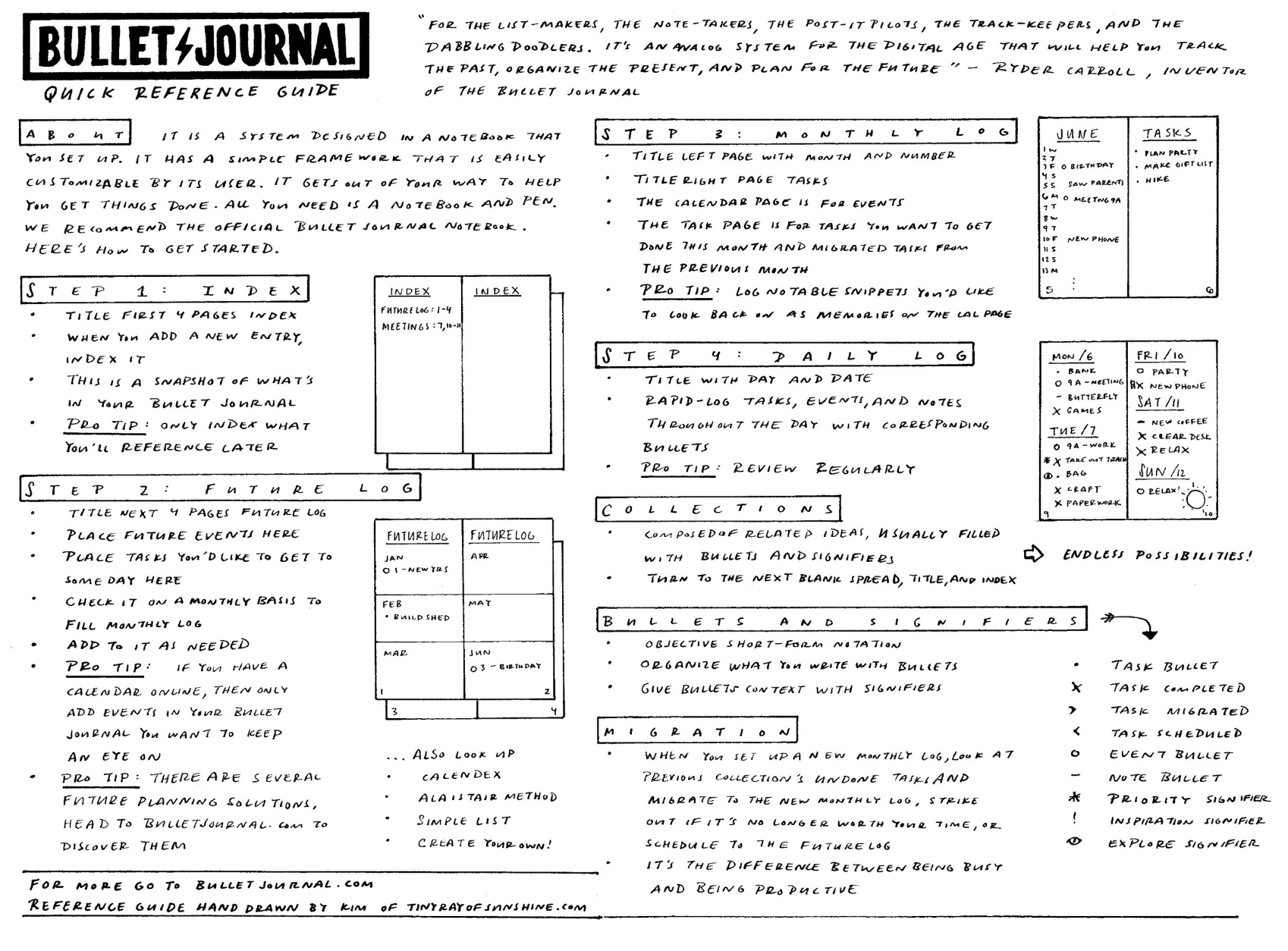
This time we’re going go over the standard method for the Bullet Journal that Ryder Carroll gives i.e. the monthly and daily views. There’s a clear difference between the monthly and daily method versus the layouts that achieve this. We will look into different layouts that will achieve a similar purpose as the standard layout.
Today we'll begin with the original: Monthly and Daily
Monthly
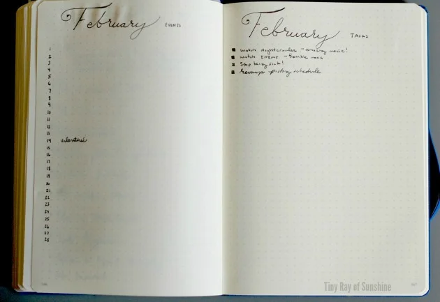
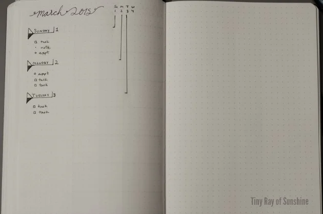
The standard monthly view is a two-page spread which consists of one of the pages being numbered vertically in order to place appointments and other events. There isn’t much room for detail here, just quick snippets. The other page is for the tasks that one wants to get done that month. Immediately following this spread, the daily pages begin.
Here is how Ryder Carroll's standard layout looks, with my spin on it with pretty lettering:
Here's a way to power-up the standard view by adding useful categorized columns. They can be anything you like. I found this to be super handy for the Instagram photo challenges, I would even leave enough room to jot down ideas of what to take photos of. I would also record what we had or were going to make for dinner for the first week or so. But it is still a useful layout, the categories will just take some tweaking. I only checked off a box for the 30 days of lists because the prompts were in another notebook specifically for those lists, here I just kept track of which days I would actually complete them. When I came up with this layout I was thinking about whether I would have the tasks pertain to the day they fell on or whether they would be independent of the days; I think that it was actually useful that there was one main task jotted down for each particular day because that was my "frog" if you will (here's a fun video about "eating your frog").
Here's a month grid view that I came up with with space for weekly goals (you could also make this section a monthly tasks section or if you left more space at the bottom could create a space there for monthly tasks). This is the view most gravitate towards because it is more intuitive:
Here's a month grid view with a freebie printable courtesy of Miss Tiina in case you don't want to draw out your layout but still want a grid view of the month. I cut it up to fit the pages. This printable has a little space on the right to write out tasks:
You can always draw out grid calendars, but if you prefer to save a little time and want a printable version instead, here are a few options:
(Back to front: Blank - me, B&W - Miss Zoot, Colorful - Picklebums, Geometric - InkWELLpress)
Here are a few month printables I have found from around the web, along with one I made. A blank freebie printable from me, it just has the grid so you can fill it in yourself. If you prefer to have the dates printed and don't mind a Sunday start, here's a freebie set of 2015 month printables designed to fit the Bullet Journal from Miss Zoot. Here's a another freebie set of 2015 month printables from Picklebums. Lastly, some beautiful geometric ones from InkWELLpress. These are nifty because they'll allow you to see your month in grid-view on one page while having room to see your task on the next.
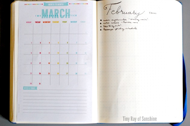
Here's a printable from Miss Tiina if you prefer a portrait view like so (or you could just use my printable but place the numbers differently). This is a good option for those who like the idea of a month grid view on one page but want it vertically instead of horizontally:
And here's another monthly view but instead of the horizontal weeks, the weeks are vertical with some space at the right for tasks like so:
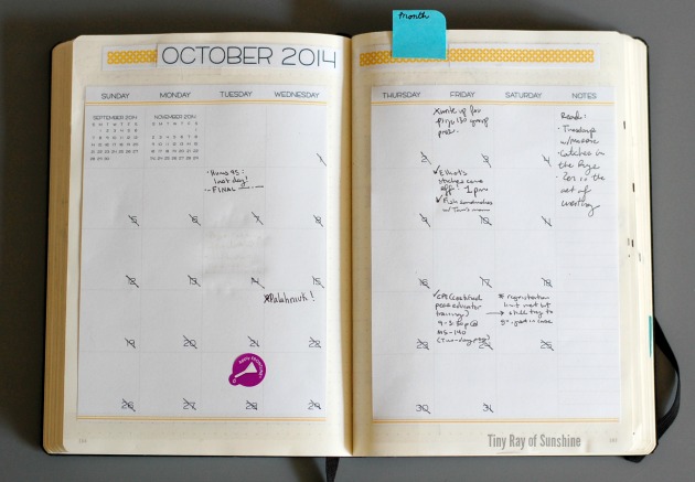
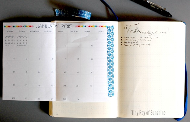
Here's a freebie month printable from Miss Tiina as a fold-out so you have an entire page just for tasks. Washi it in (the washi in this photo is from Michael's). I got the idea to add a fold-out calendar from Break it Dawns.
I had a stroke of genius the other night while thinking about this post and thought, well, I like the idea of a full grid calendar but I kind of absolutely hate flipping back and forth copying tasks from the month page to the daily pages. I always have tons of thoughts circulating in my mind (as you can probably tell) and it's hard for me to stay focused sometimes, so I thought of this beauty right here:
-
Here's how to make this one:
1. Grab a favorite notepad (This one is from an older Target dollar spot collection) or rip out a sheet from the back of your journal and grab some gloss finish scotch tape or washi tape(I didn't use washi because I wanted a cleaner look).
2. Tape the front
3. Tape a little bit of the back, only on parts you won't need to write on later. I added a little tape at the top where the calendar is and at the bottom.
5. Ta-dah! Now when you flip to a daily page, you have your month tasks in view. Hooray! You can fold it back in when you no longer need it.
Daily
The daily pages are wonderful because you can use as much room and as many pages as you need on any given day. Grabbing tasks from the month page to the daily page helps one to reach their goals.
Starting off each day is simple. Just write the date and rapid log/braindump all of the things that you would like to get done that day. You glance at the monthly spread and jot down events for the day and grab a few tasks from your monthly tasks page. Once you have that down and continue planning, you are set to go. Just remember to check this page throughout the day and write in any reminders that you would like to remember or other notes that you would like to jot down in your Bullet Journal. The solid dot signifier is great because it is incredibly useful for jotting down notes about anything whatsoever.
In addition to the big three (tasks, events, and notes) some use cases for the daily pages are: jotting down the food you ate, exercises you did and for how long, where you went, how much money you spent and where, observations, poetry snippets, etc. You get the point. Anything that you would like to write down is fair game. You don’t have to include any of these, but it’s handy to know in case you like tracking things about your day like I do. It’s also nice looking back through the pages to see where you were and what you did.
Here's an example of a typical daily page for me. I like to add a line on the side to track my activities, read more about it here:
Other pages might have a few days on them. (The bottom part is an idea from Decade Thirty):
Here's a concept page I came up with for daily pages. The idea behind it is as you add days to the pages, you write down the day and date at the top and draw a line to where you began that day. My daily pages usually only have one or two days on a page, I tend to use a page or more per day on any given day so this might not work for me. It would work better for someone without a lot of tasks and a lot of days on a page. This is just an addition for aesthetics, and I suppose a cool way to glance at the days when you're flipping through the pages to see what happened on a specific day. Let me know if you end up trying this layout out:
My favorite part about the Bullet Journal is the daily page. I've tried gazillions of printables and have even created my own and at the end of the day, I just love opening up to a fresh page in my Bullet Journal and writing down the day's tasks and activities. I keep it much simpler now.
Daily pages are extremely personal, to me it's the heart of the Bullet Journal and where you'll probably spend the bulk of your time if you decide to use this component of it.
That’s pretty much it for the monthly/daily system. Each day you start by glancing at the monthly page or just head into your daily page to rapid-log/braindump any notes, tasks or events you have on your mind and then check your monthly page. I say keep the daily layout simple, that way you spend more time doing than planning. Although, a good planning session is worth the time if it helps you be more productive.
You should use the monthly and daily method if:
You like having a tried and true system (Ryder has more or less honed this down after years of trial and error).
You like having a month view glance of your events and appointments.
You work best with a “one page a day” type of focus. Of course, you don’t have to stick to just one page a day, or even a full page! You can use as much or as little room as you need on any given day, it’s just easiest to explain it this way.
Regular planners don't have enough room for you to write down everything that you want to write down.
You like the focus of a month’s worth of tasks broken down little by little each day.
You typically have a lot of tasks on any given day that need to have an ample amount of room to be written down.
You get overwhelmed with an entire month’s worth of tasks and prefer focusing on a few at a time each day.
You like to start your day off with a bit of planning.
You like to end your night by preparing the next day’s page.
You've tried other methods and are ready to give this a shot.
Next time we will chat about using a weekly only method and some layout ideas.
If you use the monthly and daily method, what layout(s) do you use? Do you have a different month layout that you would like me to include? Have a really cool and unique daily page that you want to show off? Let me know in the comments :)
Supplies used:
- Leuchtturm1917 medium dot grid notebook
(Amazon)
*I am not affiliated with anything to do with the Bullet Journal or its creator, Ryder Carroll. I am just a Bullet Journaler who would have liked to have more direction when starting out. There are so many ideas around the interwebs and I am doing my best to compile them in an easy and digestible format. And because I've seen all the existing Bullet Journal posts out there, I want to share some of my renditions of these ideas and introduce new photos out there. All of the example photos are done in a Leuchtturm 1917 medium dot grid journal -- love this company, I am not affiliated with them. Miss Tiina is my favorite calendar printable creator out there, so I'm happy to send a little love her way; I've been using some of her freebie and paid printables for years now and have always been super happy with them.
