Tiny Tutorial: Notepaper look in your Bullet Journal
/Hello Sunshine!
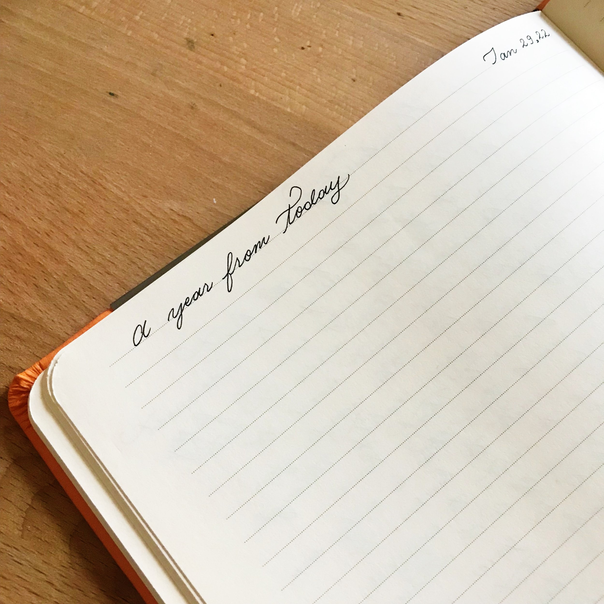
Today I have a fun little idea for you. This idea to combine the notepaper-look with the Monthly Log occurred to me this morning. I’ve been wanting to create a notepaper-inspired spread for a while, so I was excited that this came to mind.
Supplies Used:
An A5 Leuchtturm1917 dot grid notebook, Bullet Journal edition, in Nordic Blue.
A light blue Staedtler Triplus Fineliner for the lines.
A red Staedtler Triplus Fineliner for the margin.
A 6-inch mini ruler to make the lines nice and even.
How to:
Count how many lines you have in your notebook.
In the notebook I’m using, which is a Leuchtturm1917 notebook, there are 38 lines going down.
Count how many days the current month has.
April has 30 days.
Decide where you want the notepaper look to begin.
I’m starting 7 lines from the top and leaving 1 at the bottom. You can start higher or lower. I felt that this gave it good visual balance and gives me room to write something underneath the month if I want to. It also makes for good white space to not be too visually overwhelming or cluttered.
Grab the ruler and blue pen and starting drawing out the lines.
This can be a little bit tedious, but worth it when you draw the red line and it all comes together.
Tip: Count your lines as you go to make sure you’re drawing enough - not too few and not too many.
Tip: If you do end up drawing too many, you can use correction tape or let it be.
Decide where you want your margin line to be.
There are 26 lines across one page in a Leuchtturm1917 notebook.
If you draw your margin too far away from the edge of the page, you risk not having enough room on the right side of the line to write. If you draw the margin too close to the edge, it might not give that notepaper look you’re going for. It’s up to you. Various traditional notebooks, such as spiral-bound, have margins all over the place. Some are too far in the middle of the page, some super close to the edge. It depends on your preference, and the beauty of notebooks is that you can create exactly what you want in them, however you want.
Grab the ruler and red pen and draw the line for the margin.
I drew mine 5 lines in to give me just enough room to write a tiny bit on the left side while giving me plenty of room to write on the right side.
You’re done! Hooray!
That’s all you need to do to create that notepaper look. :)
Finish it off by adding the month, numbering the days of the month, and you’re ready for a fun twist on a classic!
Hope you enjoyed this mini tutorial. I had a lot of fun putting this page together and wanted to share that joy with you.
Additional mini tutorial for the serif-writing:
Supplies used:
A pencil to create an outline for the serif-inspired lettering at the top.
(I don’t often use pencil to outline beforehand, but I did this time.)
Gray ink for the month and numbers. In this case, Faber-Castell Stone Grey in a fountain pen.
How to:
Create an outline of the lettering you want to use with the pencil. (Optional)
This allows you to practice your lettering and helps you see whether your lettering is centered or not.
You don’t have to do this, you can feel free to skip to the next step.
Write out the month with pen.
Or ink from a fountain pen like I did here. It’s up to you and what you have on hand!
Done! As easy as 1, 2, 3!
Disclosure:
This article contains Amazon Affiliate links, which means that if you order items from these links, I will receive a small commission from your purchase at no extra cost to you. This helps keep Tiny Ray of Sunshine up and running, I appreciate your support! :)
Also, creating notepaper looks like this might be super addictive!
Share this with whoever you think would enjoy it! :)


